What's in a Name? Mintz Becomes Latest Big Firm to Rebrand
With its rebranding effort, Mintz has joined a growing group of law firms that have slimmed down their names for marketing purposes.
September 18, 2018 at 04:05 PM
3 minute read

Following a path trod by some of its Am Law 100 peers, Mintz, Levin, Cohn, Ferris, Glovsky and Popeo has announced a revamp of its branding—complete with a new “M” logo, a different color scheme and the dropping of all the names that follow Mintz.
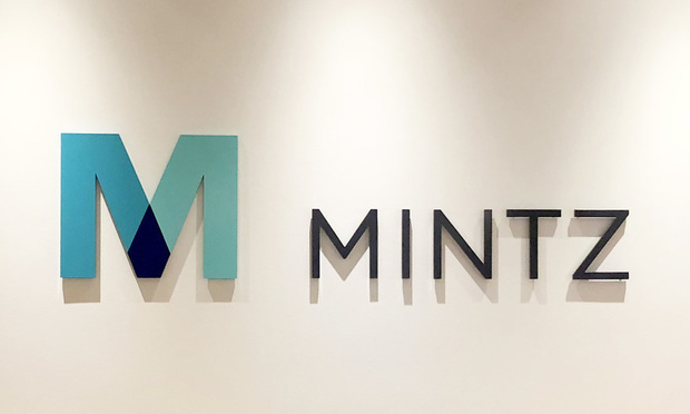
On Monday, the firm announced the launch of a new website, mintz.com, as part of a broader rebranding meant to highlight collaboration with its clients. Among other changes, the firm now has a new “M” logo, a green and teal color scheme and a single-word name: Mintz.
With its updated branding, Mintz joins a growing group of firms that have slimmed down their names to help bolster their marketing efforts. Cooley, for one, shortened its name in 2010 from Cooley Godward Kronish, while Wilmer Cutler Pickering Hale and Dorr markets itself as WilmerHale. More recently, Goodwin Procter revamped its branding and website in 2016 with the shortened name, Goodwin, and Boston-based Nutter McClennen & Fish slimmed down to Nutter.
With the exception of Cooley, the shortened names have not extended to the firms' actual, legal names. Mintz is in that same position, with the shorter marketing name but with its full name still Mintz, Levin, Cohn, Ferris, Glovsky and Popeo. The difference, according to Mintz chief marketing officer Amy Fowler, stems from “boldness and the directness” of using a one-word name for marketing while, at the same time, keeping the longer legal name as a nod to the firm's history.
“That's recognition and respect for our legacy and where we've come from,” Fowler said.
While still recognizing tradition, Mintz decided to update the look and feel of its website, logo and branding in part to signify the firm's success in recent years, according to Fowler, who noted the firm's record revenues in each of the past few years. Mintz worked on the rebrand with Genuine, a digital marketing agency that counted this as its first time working with a law firm on this kind of project. Among other areas, Genuine advised on the website redesign and guided Mintz toward a new logo design and color pallet.
The new color scheme, with its green tones, is one way of reflecting the firm's growth, said Fowler. And the new “M” logo, which features different shades of green coming together at a darker point in the center, was meant to reflect a spirit of collaboration within the firm and with its clients.
“Being on this upward trajectory,” Fowler said, “we thought it was time to update our public image to reflect where we are going.”
Related Stories:
'Goodwin,' 'Nutter' Join Rebranding Bandwagon
This content has been archived. It is available through our partners, LexisNexis® and Bloomberg Law.
To view this content, please continue to their sites.
Not a Lexis Subscriber?
Subscribe Now
Not a Bloomberg Law Subscriber?
Subscribe Now
NOT FOR REPRINT
© 2025 ALM Global, LLC, All Rights Reserved. Request academic re-use from www.copyright.com. All other uses, submit a request to [email protected]. For more information visit Asset & Logo Licensing.
You Might Like
View All
BCLP Enhances Financial Disputes and Investigations Practice With Baker McKenzie Partner
2 minute read
Blank Rome Snags Two Labor and Employment Partners From Stevens & Lee
4 minute read
12-Partner Team 'Surprises' Atlanta Firm’s Leaders With Exit to Launch New Reed Smith Office
4 minute read
After Breakaway From FisherBroyles, Pierson Ferdinand Bills $75M in First Year
5 minute readTrending Stories
- 1SDNY Criminal Division Deputy Chief Returns to Debevoise
- 2Brownstein Adds Former Interior Secretary, Offering 'Strategic Counsel' During New Trump Term
- 3Tragedy on I-95: Florida Lawsuit Against Horizon Freight System Could Set New Precedent in Crash Cases
- 4Weil, Loading Up on More Regulatory Talent, Adds SEC Asset Management Co-Chief
- 5Big Banks Did Great Last Year. What Does That Mean for Big Law?
Who Got The Work
J. Brugh Lower of Gibbons has entered an appearance for industrial equipment supplier Devco Corporation in a pending trademark infringement lawsuit. The suit, accusing the defendant of selling knock-off Graco products, was filed Dec. 18 in New Jersey District Court by Rivkin Radler on behalf of Graco Inc. and Graco Minnesota. The case, assigned to U.S. District Judge Zahid N. Quraishi, is 3:24-cv-11294, Graco Inc. et al v. Devco Corporation.
Who Got The Work
Rebecca Maller-Stein and Kent A. Yalowitz of Arnold & Porter Kaye Scholer have entered their appearances for Hanaco Venture Capital and its executives, Lior Prosor and David Frankel, in a pending securities lawsuit. The action, filed on Dec. 24 in New York Southern District Court by Zell, Aron & Co. on behalf of Goldeneye Advisors, accuses the defendants of negligently and fraudulently managing the plaintiff's $1 million investment. The case, assigned to U.S. District Judge Vernon S. Broderick, is 1:24-cv-09918, Goldeneye Advisors, LLC v. Hanaco Venture Capital, Ltd. et al.
Who Got The Work
Attorneys from A&O Shearman has stepped in as defense counsel for Toronto-Dominion Bank and other defendants in a pending securities class action. The suit, filed Dec. 11 in New York Southern District Court by Bleichmar Fonti & Auld, accuses the defendants of concealing the bank's 'pervasive' deficiencies in regards to its compliance with the Bank Secrecy Act and the quality of its anti-money laundering controls. The case, assigned to U.S. District Judge Arun Subramanian, is 1:24-cv-09445, Gonzalez v. The Toronto-Dominion Bank et al.
Who Got The Work
Crown Castle International, a Pennsylvania company providing shared communications infrastructure, has turned to Luke D. Wolf of Gordon Rees Scully Mansukhani to fend off a pending breach-of-contract lawsuit. The court action, filed Nov. 25 in Michigan Eastern District Court by Hooper Hathaway PC on behalf of The Town Residences LLC, accuses Crown Castle of failing to transfer approximately $30,000 in utility payments from T-Mobile in breach of a roof-top lease and assignment agreement. The case, assigned to U.S. District Judge Susan K. Declercq, is 2:24-cv-13131, The Town Residences LLC v. T-Mobile US, Inc. et al.
Who Got The Work
Wilfred P. Coronato and Daniel M. Schwartz of McCarter & English have stepped in as defense counsel to Electrolux Home Products Inc. in a pending product liability lawsuit. The court action, filed Nov. 26 in New York Eastern District Court by Poulos Lopiccolo PC and Nagel Rice LLP on behalf of David Stern, alleges that the defendant's refrigerators’ drawers and shelving repeatedly break and fall apart within months after purchase. The case, assigned to U.S. District Judge Joan M. Azrack, is 2:24-cv-08204, Stern v. Electrolux Home Products, Inc.
Featured Firms
Law Offices of Gary Martin Hays & Associates, P.C.
(470) 294-1674
Law Offices of Mark E. Salomone
(857) 444-6468
Smith & Hassler
(713) 739-1250


