Why This Am Law Firm Kept Partners in the Dark on a Branding Overhaul
To ease a major rebranding effort, fast-growing Goldberg Segalla opted to keep most of the partnership out of the loop.
June 20, 2019 at 10:21 AM
4 minute read
 Goldberg Segalla's new branding and design scheme on the firm's website. (Courtesy photo)
Engineering a law firm rebranding, which means a lot more than changing fonts and color schemes, is never easy. Try also keeping the details hidden from most of the partnership.
That's how managing partner Richard Cohen chose to approach the task at Buffalo-based Goldberg Segalla, a fast-growing firm that broke into the Am Law 200 two years ago.
“We have tried, like a lot of firms have, to do it by a 'committee of all,'” Cohen said, referring to getting broad input from the partnership. “We had some level of frustration trying to get our full ownership community totally reconciled with respect to the vision.”
In the end, the vision culminated in a new color pallet, new logo, new website, and a custom-made management structure for the rebranding effort.
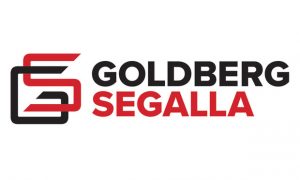 Goldberg Segalla's redesigned logo.
Cohen said the 400-lawyer firm went through due diligence with outside branding consultants, eventually settling on an arrangement that would incorporate a small committee of three partners in leadership roles, the outside consultants and an internal branding group that would make the decisions.
“We believed they had a skill set and spirit and understanding of branding that quite frankly our ownership group, as lawyers, didn't necessarily have,” Cohen said, referring to the firm's internal branding team.
Cohen equated the decision to defer to the branding and marketing teams to an advertising agency looking for legal advice. They would be better served asking a lawyer for guidance than, say, “Kevin” from graphic design. Cohen said the same logic could be applied for a law firm looking for branding advice.
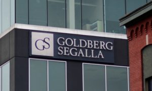 The firm's old logo as seen on its Buffalo headquarters.
Cohen said the firm was also prepared for the idea that not everyone was going to be on board with the process.
“It's human nature, particularly with lawyers, to have an array of differing opinions with respect to almost anything,” Cohen said. “We recognized that when we did unveil the concept to our ownership community that it was extremely unlikely that all of us would have the exact same vision. We were prepared for a wide array of reactions.”
Cohen said they were pleased, but not surprised, that the rebrand thus far has gotten a positive response.
As with most rebrands, the optics of the firm's defining colors and logo were changed. Gone are the traditional navy blue and white color scheme and oft-used serif font. In Goldberg's case, their replacements are a distinct black and red pallet and a much more visually complex intersecting of the “G” and “S” that compose the firm's logo.
Cohen said the color and logo redesign were meant to represent “who the firm is now,” and not who they were 18 years ago when they had seven attorneys and were first starting out.
Although Goldberg did follow the color change route well worn by other firms, it did not choose to shorten its firm name, which has been another trend firms have fallen into. The firm is also positioning the rebrand not as a retooling of core competencies and focus or to highlight the opening of a new office, but rather an emphasis on the values that the firm has attempted to uphold since its founding in 2001.
“We believe the new look conveys the dynamic strength, capacity, energy, and focus of Goldberg Segalla today—and well into the future,” Cohen said in a statement. “But more importantly, it captures why we have always called ourselves 'different'—and why that isn't going to change.”
Founded in 2001 in Buffalo with seven lawyers, Goldberg Segalla now has 22 offices in the U.S. and abroad. The firm ranks 175th on the Am Law 200 with revenue of $128.8 million last year.
Read More
With 27 Lateral Hires in a Month, Goldberg Segalla Makes Case It's 'Different'
More Than Just a Name Change: 'Everything is on the Table' When a Law Firm Rebrands
Law Firms Are Relying More on Staff—and Treating Them More Like Lawyers
This content has been archived. It is available through our partners, LexisNexis® and Bloomberg Law.
To view this content, please continue to their sites.
Not a Lexis Subscriber?
Subscribe Now
Not a Bloomberg Law Subscriber?
Subscribe Now
NOT FOR REPRINT
© 2025 ALM Global, LLC, All Rights Reserved. Request academic re-use from www.copyright.com. All other uses, submit a request to [email protected]. For more information visit Asset & Logo Licensing.
You Might Like
View All

Three Akin Sports Lawyers Jump to Employment Firm Littler Mendelson
Brownstein Adds Former Interior Secretary, Offering 'Strategic Counsel' During New Trump Term
2 minute read
Trending Stories
- 1Paul Hastings, Recruiting From Davis Polk, Continues Finance Practice Build
- 2Chancery: Common Stock Worthless in 'Jacobson v. Akademos' and Transaction Was Entirely Fair
- 3'We Neither Like Nor Dislike the Fifth Circuit'
- 4Local Boutique Expands Significantly, Hiring Litigator Who Won $63M Verdict Against City of Miami Commissioner
- 5Senior Associates' Billing Rates See The Biggest Jump
Who Got The Work
J. Brugh Lower of Gibbons has entered an appearance for industrial equipment supplier Devco Corporation in a pending trademark infringement lawsuit. The suit, accusing the defendant of selling knock-off Graco products, was filed Dec. 18 in New Jersey District Court by Rivkin Radler on behalf of Graco Inc. and Graco Minnesota. The case, assigned to U.S. District Judge Zahid N. Quraishi, is 3:24-cv-11294, Graco Inc. et al v. Devco Corporation.
Who Got The Work
Rebecca Maller-Stein and Kent A. Yalowitz of Arnold & Porter Kaye Scholer have entered their appearances for Hanaco Venture Capital and its executives, Lior Prosor and David Frankel, in a pending securities lawsuit. The action, filed on Dec. 24 in New York Southern District Court by Zell, Aron & Co. on behalf of Goldeneye Advisors, accuses the defendants of negligently and fraudulently managing the plaintiff's $1 million investment. The case, assigned to U.S. District Judge Vernon S. Broderick, is 1:24-cv-09918, Goldeneye Advisors, LLC v. Hanaco Venture Capital, Ltd. et al.
Who Got The Work
Attorneys from A&O Shearman has stepped in as defense counsel for Toronto-Dominion Bank and other defendants in a pending securities class action. The suit, filed Dec. 11 in New York Southern District Court by Bleichmar Fonti & Auld, accuses the defendants of concealing the bank's 'pervasive' deficiencies in regards to its compliance with the Bank Secrecy Act and the quality of its anti-money laundering controls. The case, assigned to U.S. District Judge Arun Subramanian, is 1:24-cv-09445, Gonzalez v. The Toronto-Dominion Bank et al.
Who Got The Work
Crown Castle International, a Pennsylvania company providing shared communications infrastructure, has turned to Luke D. Wolf of Gordon Rees Scully Mansukhani to fend off a pending breach-of-contract lawsuit. The court action, filed Nov. 25 in Michigan Eastern District Court by Hooper Hathaway PC on behalf of The Town Residences LLC, accuses Crown Castle of failing to transfer approximately $30,000 in utility payments from T-Mobile in breach of a roof-top lease and assignment agreement. The case, assigned to U.S. District Judge Susan K. Declercq, is 2:24-cv-13131, The Town Residences LLC v. T-Mobile US, Inc. et al.
Who Got The Work
Wilfred P. Coronato and Daniel M. Schwartz of McCarter & English have stepped in as defense counsel to Electrolux Home Products Inc. in a pending product liability lawsuit. The court action, filed Nov. 26 in New York Eastern District Court by Poulos Lopiccolo PC and Nagel Rice LLP on behalf of David Stern, alleges that the defendant's refrigerators’ drawers and shelving repeatedly break and fall apart within months after purchase. The case, assigned to U.S. District Judge Joan M. Azrack, is 2:24-cv-08204, Stern v. Electrolux Home Products, Inc.
Featured Firms
Law Offices of Gary Martin Hays & Associates, P.C.
(470) 294-1674
Law Offices of Mark E. Salomone
(857) 444-6468
Smith & Hassler
(713) 739-1250


